


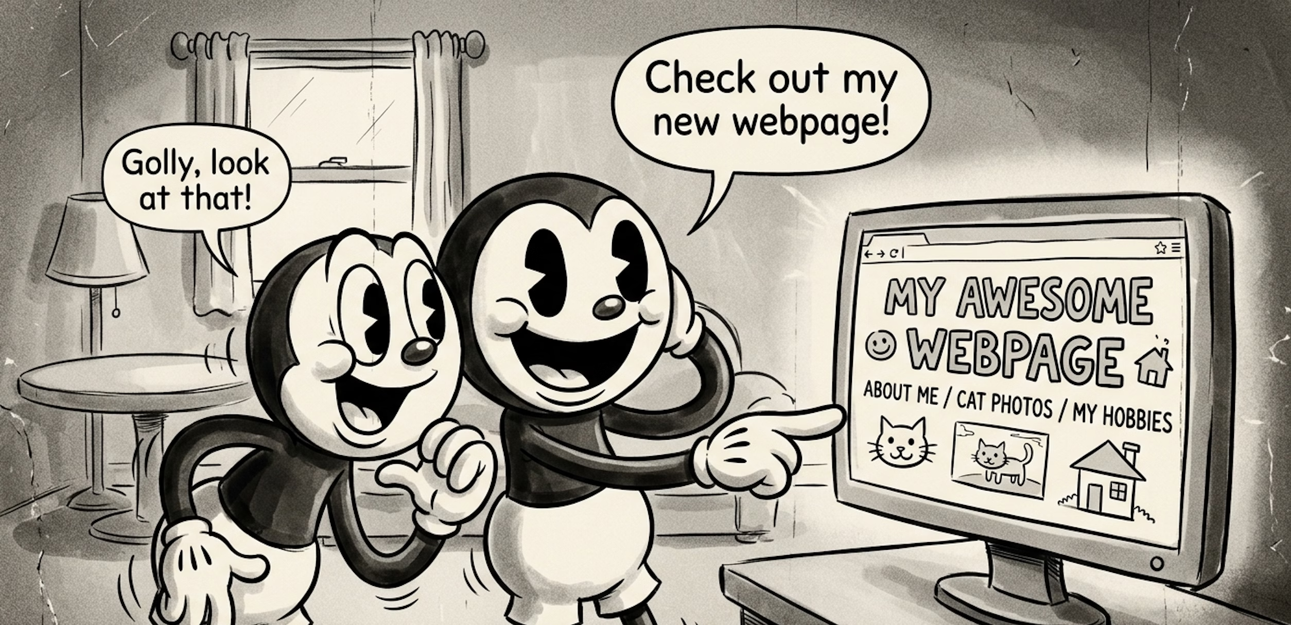
This guide will help you publish a responsive webpage or WordPress website without getting too detailed. This guide will not explain everything. Search the web for deeper learning.
What You’ll Need
To build a responsive webpage you will need:
- Web hosting – A place to store your website code and show people your webpage when they ask for it from their web browser.
- Domain name – Web hosts often include this. This website’s domain name is wilcosky.com.
- Code – This guide will provide you with two options. A simple webpage comprised of HTML and CSS code. Or, some WordPress basics. WordPress will allow you to create an entire multiple page website with an editor instead of manually coding everything.
The Basics
We’ll start with the simple webpage. What you see below are HTML tags. The following is technically a valid webpage.
<html>
<head>
<title>Page Title</title>
</head>
<body>
</body>
</html>
However, no one publishes a webpage like this. Not just because there’s no content. At a minimum, you’d want to change the <html> tag to <!doctype html> and follow that up with <html lang=”en”>. Because the !doctype tells the browser to use standards mode and the other tag tells the browser the page’s language is English.
So, a better bare bones example is:
<!doctype html>
<html lang="en">
<head>
    <meta charset="utf-8">
    <title>Page Title</title>
</head>
<body>
</body>
</html>
I also just snuck in a “meta tag” above. This charset meta tag declares the character encoding for the page (utf-8). In an effort to keep this guide as quick and simple as possible, for now just know that this helps make sure text displays correctly, including symbols and characters from other languages.
There are two other important facts to know right now.
- HTML pages are similar to the human body. How? They have a <head>, <body>, and many times a <footer>.
- Everything begins, and everything ends*.
- <html> = beginning of the html
- </html> = end of the html
- <body> = beginning of the parts that are seen by human eyes
- </body> = end of the parts seen by human eyes
So, the forward slash before the tag name means, end.
*Almost everything always ends.
Some special HTML won’t have an ending </> tag. Like meta tags. They are just:
<meta charset="utf-8">You would not follow that up with </meta>.
Same with images.
<img src="cat.jpg" alt="Cat">Although, because of past versions of HTML, some people add an ending slash to image tags:
<img src="cat.jpg" alt="Cat" />And, of course, html tags are surrounded by angle brackets (< >).
Also, most people will indent HTML and other types of code certain ways. It’s to make it easier for a human to read. The web browser and server doesn’t care about that part. So, indent… or don’t… it’s your funeral… I mean, webpage.
Now, let’s throw you right into the deep end and show you code for a full webpage.
Ready? *Push*
Full Webpage Template
<!doctype html>
<html lang="en">
<head>
<meta charset="utf-8">
<meta name="viewport" content="width=device-width, initial-scale=1">
<title>How to Build a Website</title>
<meta name="description" content="Learn how to build a modern, responsive HTML5 website using semantic markup and lightweight CSS.">
<meta name="author" content="Your Name">
<meta name="robots" content="index, follow">
<meta name="theme-color" content="#ffffff">
<link rel="icon" href="/favicon.ico" sizes="any">
<link rel="icon" href="/icon.svg" type="image/svg+xml">
<!-- Open Graph -->
<meta property="og:type" content="article">
<meta property="og:title" content="How to Build a Modern Website">
<meta property="og:description" content="A lightweight HTML5 webpage template with accessibility and SEO built in.">
<meta property="og:image" content="https://example.com/og-image.jpg">
<meta property="og:url" content="https://example.com/page/">
<meta property="og:site_name" content="Example Site">
<style>
:root{
--bg:#ffffff;
--surface:#f5f5f5;
--text:#111111;
--muted:#666666;
--border:#dddddd;
--accent:#0066cc;
--max-width:800px;
}
@media (prefers-color-scheme: dark){
:root{
--bg:#121212;
--surface:#1d1d1d;
--text:#f5f5f5;
--muted:#aaaaaa;
--border:#333333;
--accent:#66b3ff;
}
}
*,
*::before,
*::after{
box-sizing:border-box;
}
html{
scroll-behavior:smooth;
}
body{
margin:0;
font:16px/1.6 system-ui,-apple-system,BlinkMacSystemFont,"Segoe UI",sans-serif;
background:var(--bg);
color:var(--text);
}
img{
display:block;
max-width:100%;
height:auto;
}
a{
color:var(--accent);
}
.skip-link{
position:absolute;
left:-9999px;
}
.skip-link:focus{
left:1rem;
top:1rem;
background:var(--bg);
padding:.5rem;
border:1px solid var(--border);
}
.container{
width:min(100% - 2rem, var(--max-width));
margin-inline:auto;
}
.hero{
padding:4rem 0 3rem;
text-align:center;
}
.hero h1{
margin:0;
line-height:1.2;
}
.hero p{
color:var(--muted);
max-width:60ch;
margin:1rem auto 0;
}
article{
padding-bottom:3rem;
}
figure{
margin:2rem 0;
}
.placeholder{
aspect-ratio:16/9;
background:var(--surface);
border:1px solid var(--border);
border-radius:.5rem;
}
figcaption{
margin-top:.5rem;
color:var(--muted);
font-size:.9rem;
}
footer{
border-top:1px solid var(--border);
padding:2rem 0;
text-align:center;
color:var(--muted);
}
</style>
</head>
<body>
<a href="#content" class="skip-link">Skip to content</a>
<header class="hero">
<div class="container">
<h1>How to Build a Modern Website</h1>
<p>
Learn the foundations of semantic HTML, responsive design,
accessibility, and SEO with this lightweight template.
</p>
</div>
</header>
<main id="content" class="container">
<article>
<section>
<h2>Introduction</h2>
<p>
This template demonstrates a clean, modern layout that works
across phones, tablets, laptops, and desktops.
</p>
</section>
<figure>
<div class="placeholder" aria-hidden="true"></div>
<figcaption>
Example image placeholder.
</figcaption>
</figure>
<section>
<h2>Step 1</h2>
<p>
Add your content using semantic HTML elements such as
headings, paragraphs, lists, figures, and sections.
</p>
</section>
<figure>
<div class="placeholder" aria-hidden="true"></div>
<figcaption>
Another image placeholder.
</figcaption>
</figure>
<section>
<h2>Step 2</h2>
<p>
Keep layouts simple, responsive, and easy to read. Mobile-first
design often leads to better user experiences.
</p>
</section>
</article>
</main>
<footer>
<div class="container">
<p>© 2026 Example Site. All rights reserved.</p>
</div>
</footer>
</body>
</html>You okay? I know, that’s a lot of code.
Listen, there are more minimal HTML template examples out there but I think it’s best to show you a version like what you see above because it:
- Is responsive – Looks good on all screen sizes
- Includes CSS – CSS is what changes colors, sizes, spacing, positions (the looks) – and it’s within the <head></head> tags.
- It’s also CSS in a way that saves you time in the long run once you learn more
- Includes automatic dark mode – If the visitor’s device is in dark mode, your webpage will be too. Maybe it’s crazy to have this in a beginner article, but you can handle it. I have faith in you.
- Social media sharing friendly
- Has a good variety of HTML tags you should learn
You can copy all of the code above, paste it into a text document, save it as html, and you have a webpage.
Next, I’ll walk you through each part. But first, especially in today’s world, remember to look out for the mobile viewport explanation below. Many times beginners will wonder why their webpage is so small on their phone. It’s because they forgot to add the mobile viewport tag.
Okay, here’s the walkthrough. Feel free to go take a nap first and come back.
HTML Template Walkthrough
The First Line
<!doctype html>This tells the browser that the page uses modern HTML5.
Older versions of HTML required longer declarations. Today, this single line is all you need.
It should be the very first line in your file.
The HTML Element
<html lang="en">The <html> element contains the entire web page.
The lang="en" attribute tells browsers and screen readers that the page is written in English.
This helps with accessibility and search engines.
The Head Section
<head>The <head> section contains information about the page.
Most of the content inside the head is not displayed directly on the screen.
Instead, it provides instructions for browsers, search engines, and social media platforms.
Character Encoding
<meta charset="utf-8">This tells the browser which character set to use.
UTF-8 supports letters, numbers, symbols, and characters from many languages.
Most modern websites use UTF-8.
Mobile Viewport
<meta name="viewport" content="width=device-width, initial-scale=1">This is one of the most important tags for mobile devices.
Without it, phones may try to display the page as if it were designed for a desktop monitor.
This tag tells the browser to match the screen width of the device.
The Page Title
<title>How to Build a Modern Website</title>The title appears:
- In the browser tab
- In search engine results
- When users bookmark the page
Every page should have a unique title.
Meta Description
<meta name="description" content="...">The description summarizes the page.
Search engines often use this text beneath the page title in search results.
A clear description can help users decide whether to visit your page.
Author Meta Tag
<meta name="author" content="Your Name">This identifies the author of the page.
While search engines generally do not use it for rankings, it can still be useful for documentation and content management.
Robots Meta Tag
<meta name="robots" content="index, follow">This tells search engines:
indexmeans add this page to search results.followmeans follow links found on this page to add more to search results.
Theme Color
<meta name="theme-color" content="#ffffff">Some browsers use this color for interface elements.
For example, mobile browsers may color part of the browser toolbar using this value.
Favicons
<link rel="icon" href="/favicon.ico">A favicon is the small icon shown in browser tabs and bookmarks.
Adding a favicon helps visitors recognize your website.
Open Graph Tags
<meta property="og:title" content="...">
<meta property="og:description" content="...">
<meta property="og:image" content="...">
Open Graph tags control how a page appears when shared on social media platforms and messaging apps.
They determine:
- The title shown
- The description shown
- The image shown
Without Open Graph tags, social platforms must guess which content to display.
Many platforms use Open Graph data, making it one of the most useful ways to control link previews across the web.
CSS
<style>
...
</style>
The CSS section appears inside the head.
CSS stands for Cascading Style Sheets.
HTML provides structure.
CSS controls appearance.
CSS tells the browser things such as:
- Colors
- Fonts
- Spacing
- Widths
- Layouts
- Dark mode styles
Without CSS, pages still work, but they usually look plain.
CSS Variables
:root {
    --bg: #ffffff;
    --text: #111111;
}
Variables allow you to store values and reuse them.
Instead of typing the same color repeatedly, you define it once and reference it throughout the stylesheet.
This makes future changes easier.
Dark Mode
@media (prefers-color-scheme: dark)This checks whether the visitor’s device is using dark mode.
If dark mode is enabled, different colors can automatically be applied.
Users do not need to click a button or change a setting on your site.
The Universal Selector
*,
*::before,
*::after {
    box-sizing: border-box;
}
This applies a rule to all elements on the page.
The box-sizing: border-box setting makes layouts easier to manage because padding and borders are included in an element’s total width and height.
Most modern websites use this approach.
The Body Section
<body>The body contains everything visible on the page.
If visitors can see it, it usually belongs somewhere inside the body.
Skip Link
<a href="#content" class="skip-link">This accessibility feature allows keyboard and screen reader users to skip directly to the main content.
It improves navigation for people who do not use a mouse.
The Container
<div class="container">The container helps keep content centered and prevents text from stretching too wide across large screens.
Long lines of text can be difficult to read, so most websites use a container with a maximum width.
Header
<header>The header usually contains:
- The site title
- The page title
- Navigation
- Introductory content
In our template, the header contains the hero section at the top of the page.
Hero Section
<header class="hero">The hero section is the large area near the top of the page.
It usually contains:
- The main heading
- A short introduction
- Important information about the page
Visitors often see the hero section first.
Main
<main>The main element contains the primary content of the page.
A page should generally have only one main element.
Screen readers use it to quickly locate the primary content area.
Article
<article>The article element contains self-contained content.
Examples include:
- Blog posts
- Tutorials
- News stories
- Documentation
The tutorial content in our template lives inside an article.
Sections
<section>Sections divide content into logical groups.
For example:
- Introduction
- Step 1
- Step 2
- Conclusion
Each section usually begins with a heading.
Headings
<h1>
<h2>
Headings create structure.
The main page title should usually be an <h1>.
Major sections often use <h2> headings.
Subsections may use <h3>, <h4>, and so on.
Proper heading structure improves readability and accessibility.
Paragraphs
<p>Paragraph tags contain normal text.
Most written content on a website is placed inside paragraph elements.
Figures
<figure>A figure contains media such as:
- Images
- Diagrams
- Charts
- Screenshots
Using a figure element helps browsers and assistive technologies understand that the content is related.
Image Placeholders
<div class="placeholder"></div>The template uses simple placeholder boxes instead of actual images.
These placeholders reserve space in the layout while you are building the page.
Later, you can replace them with real image elements.
Figure Captions
<figcaption>A caption describes the image or media.
This gives visitors additional context.
Footer
<footer>The footer appears near the bottom of the page.
Common footer content includes:
- Copyright information
- Contact links
- Legal notices
- Additional navigation
Reminder
Most things end. I didn’t always type this out above as I explained each tag/section. But, remember that a <p> will have a </p>. A <div> will have a </div>. The <body> will eventually have a </body>.
The WordPress Option
Now, manually building a website with a bunch of pages coded from scratch can take a lot of time and be frustrating to update. So, this is where the WordPress option comes in.
WordPress is a blogging and content management system, or CMS.
Something like 42% of the web is powered by WordPress websites as of writing this article.
Yes, you can go to wordpress.com and build your website there using their web hosting. But, you don’t have to. WordPress is open source. This means you can take a copy of the WordPress code and install it where you’d like. Your website does not have to live within wordpress.com. You can 100% own and control it. The open source WordPress world is at wordpress.org.
Many web hosts will let you install WordPress with a few clicks. They make it crazy easy.
After it’s installed and you log in, you’ll be able to search for and install a theme. There are tons of free themes you can install with a click. So you can go from a minimal website that’s black and white, to something more complex and colorful just by searching and clicking install.
Purchase Hosting
Whether you choose to build simple webpages (something like the code example above), or install WordPress, here’s how to take the next steps and build something.
- Purchase web hosting – This link goes to Hostinger which at the time of writing this article was offering a free domain name for a year, and hosting for just about $38 a year. Yeah, a year. Not a month. It’s that cheap. So, just ask your Mom or Dad for $40 and you have a website for a year. Oh, you’re 52? Well, then you have the money.
- 1-click install WordPress following the web host’s instructions OR upload your HTML page(s) to the web host’s file manager if you’re not going to use WordPress.
- Enjoy.
Since WordPress is the easiest and most powerful route, I’ll push you in that direction. So, once you follow your web host’s instructions and have WordPress installed. You’ll log in and be in the admin dashboard. Where you can adjust settings, create pages, blog posts, install themes, and install plugins.
But Wait, Play Around First
Before you do anything above, I recommend going to this free WordPress playground and mess around.
Hover over My WordPress Website, click on Dashboard and look around. You can’t break anything.
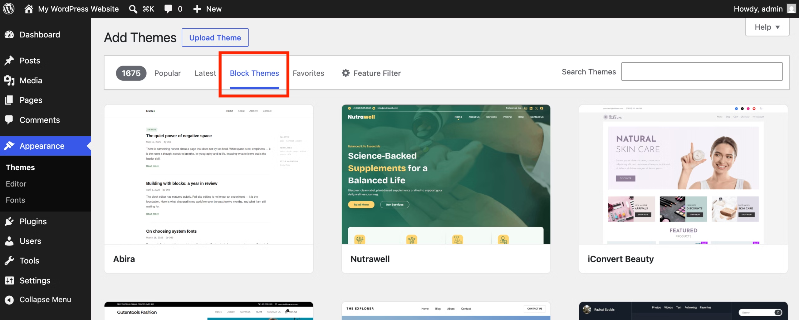
Then go to Themes. Search for and install different themes. If needed, close your browser and start over with a fresh playground instance and try again.
In the admin dashboard go to Appearance and then Editor. Click on the site preview that you see. Read the tutorial and start editing.
To create a new page go to Appearance -> Editor -> Pages -> Add Page.
Rinse and repeat. Play around until things click and you can successfully edit the homepage and create a new page. Then, go buy the web hosting.
One last tip. Install what is called a Block Theme. There are Classic, Hybrid, and full Block themes. The full site editing block themes are the newest way to build with WordPress. Some people prefer the classic ways, but if you’re brand new to WordPress, you might as well learn the new ways.
This article could keep going for days. I left a lot out. But I wanted to attempt to give everything needed to get started as quickly as possible.
And yes, there are other ways. Different ways to host your website such as cloud hosting, VPS (virtual private server), and so on. I didn’t even touch JavaScript in this article… But, I hope this helps someone, someday, with something.
Comments
No comments yet.